
Unlocking the Power of Data in the NDIS: What It Means for You
By Sinclair Hurtis · 21 April 2026

Public NDIS data already holds the answers to questions every provider, coordinator and policymaker is asking. Where is demand growing, are services meeting need, and where should funding go next. The challenge is not the data. It is turning the data into decisions.
If you are part of the NDIS world, whether as a provider, participant, Plan Manager, Local Area Coordinator or policymaker, you know how important data is. You also know how overwhelming it can feel.
At CollabEdge Solutions, we have been building data-driven solutions to help the NDIS sector get real insight into service gaps, compliance and participant needs. Working with Daniel Beelitz, a Data Analytics student at La Trobe University, we built a set of interactive Power BI dashboards on public NDIS data to show what is possible.
This article walks through three of them, and what each one means for the people making decisions.
What Can NDIS Data Actually Tell You?
With the right analysis, public NDIS data answers questions that would otherwise be guesswork. Which regions have the greatest growth potential. Whether services in a specific area are keeping up with participant need. Where funding and resources should be prioritised before shortages appear, rather than after.
The difference between a reactive organisation and a proactive one is rarely effort. It is whether decisions are made on evidence or on instinct. The dashboards below show what evidence looks like.
Where NDIS Services Are Growing Fastest
We imported NDIA projected growth data into Power BI to map where NDIS participant numbers are expected to rise.
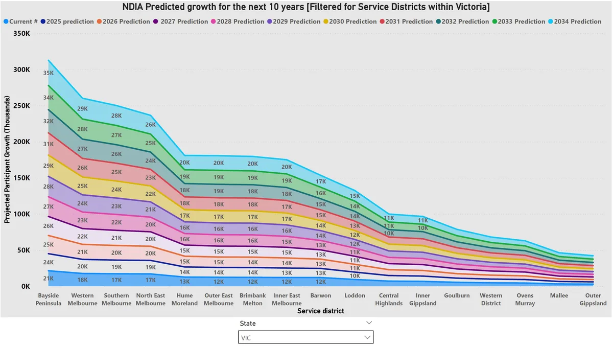
For providers, the growth map informs three decisions. Expansion planning, by focusing on high-growth areas before competitors arrive. Workforce planning, by hiring and training staff in the service districts where demand is heading. And service design, by adapting offerings to the participant needs those regions will bring.
For government agencies and policymakers, the same map supports smarter funding allocation, directing resources where they will be needed most, planning infrastructure and accessibility ahead of demand, and targeting workforce incentives where provider growth must keep pace.
Utilisation Rates Tell the Real Story
Projected growth shows where demand is heading. Utilisation rates show whether the services already in place are actually being used. Zooming in on Brimbank Melton in Victoria, we analysed utilisation over time for specific disability categories.
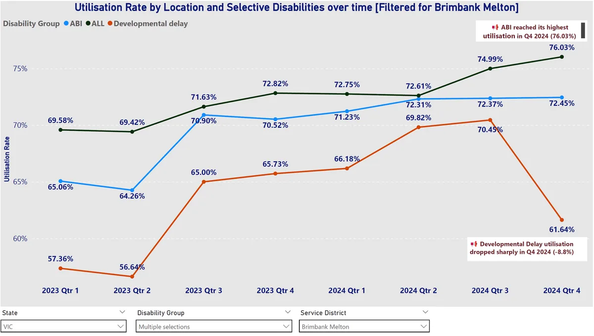
A single number makes the point. When utilisation for Developmental Delay drops from 70.45 per cent to 61.64 per cent, that is a red flag demanding a question. Is the drop caused by too few providers, poor outreach, or funding that no longer matches need. Without the data, nobody asks the question until the service gap has already hurt participants. With it, providers can identify gaps and adjust capacity while the problem is still small, and policymakers can target funding at the regions and categories where it will close a real gap.
Data Keeps Providers Compliant Too
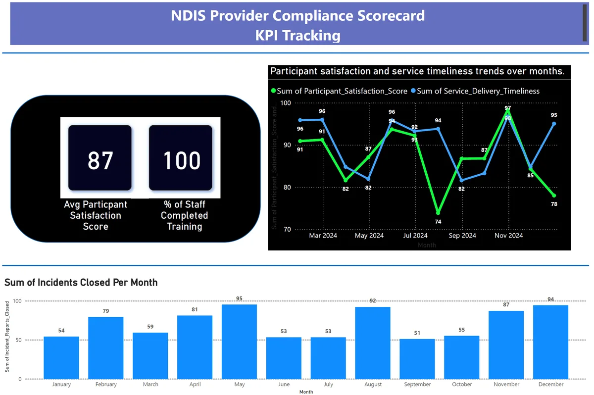
Compliance is where data analysis pays for itself fastest. Falling short of requirements is not an option for a registered provider, and the evidence burden is rising as the NDIS Quality and Safeguards Commission expands its enforcement capability.
A compliance dashboard tracks the key performance indicators that show whether services are meeting participant needs, surfaces compliance risks while they are still small, and provides the continuous improvement evidence that audits increasingly expect to see.
Digital Foundations Come First
Not every provider is ready to dive into analytics straight away, and that is fine. The first step in any data journey is getting the operational foundations right, because analytics built on paper forms and scattered spreadsheets analyses noise.
A current example from our own practice: we are working with an NDIS provider managing 70 participants, turning paper-based forms into digital versions and automating the daily processes around them. Less paperwork, more time with participants, and critically, every digitised process starts producing the clean data that reporting, compliance tracking and analytics are built on later.
Where to Start With Data-Driven Decisions
The starting point is not a tool. It is a list of business questions. What do you actually need to know to run your organisation better. We use a structured set of more than 30 strategic NDIS business questions and scenarios to help providers work out what to measure and why, before any dashboard gets built.
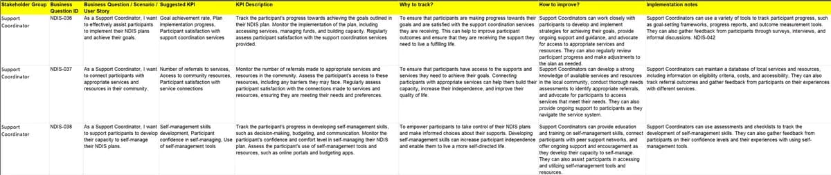
If you would like to work through it for your organisation, book a free 30 minute conversation and we will walk the questions together. No sales pitch, and you keep the thinking either way.
A sincere thank you to Daniel Beelitz for his work on this project. He is doing excellent work in data analytics, and you can connect with Daniel on LinkedIn to follow his journey.
Sinclair Hurtis is an active NDIS Support Coordinator, partnering with My Ability Services in Melbourne, and the founder of CollabEdge Solutions, with three decades of data and analytics delivery across Australia and Asia Pacific. Read more about Sinclair.